
143
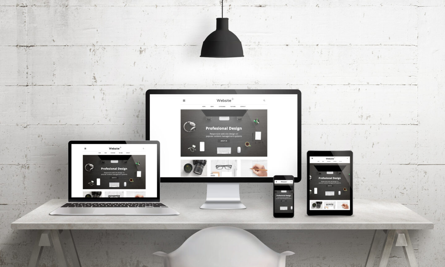
The digital landscape has fundamentally transformed over the past decade. Users no longer browse the internet exclusively through desktop monitors or bulky laptop screens. Instead, they access web content on a staggering array of devices, ranging from massive widescreen televisions and high-resolution tablets to compact smartphones and wearable technology. In this multi-device environment, fixed-width website layouts are entirely obsolete. If a website fails to adapt fluidly to the screen size of the user visiting it, visitors will leave within seconds. Responsive web design provides the strategic solution to this challenge, ensuring that digital experiences remain visually compelling, functionally sound, and exceptionally accessible regardless of the hardware being used.
Embracing Fluid Grids and Flexible Layouts
The foundation of any robust responsive design framework is the fluid grid system. Traditional web design relied heavily on fixed pixel widths, which forced elements to break or overflow when viewed on smaller viewports. Fluid grids replace rigid measurements with relative units, primarily percentages, allowing page elements to scale proportionally based on the browser window size.
-
Proportional Sizing: Define layout columns using percentages rather than hardcoded pixels so that containers expand and contract naturally.
-
Modern Layout Engines: Utilize modern CSS layout systems like Flexbox and Grid, which inherently support dynamic alignment, wrapping, and space distribution without complex math.
-
Avoiding Fixed Widths: Restrict the use of absolute pixel widths on primary container elements, reserving them only for small UI components that require strict dimensional consistency.
Adopting a Mobile-First Design Philosophy
Designing for mobile devices first rather than scaling down from a desktop version is a proven industry standard. When you start your design process on the smallest screen, you are forced to prioritize core content, essential features, and clean user flows.
-
Content Hierarchy: Determine what information matters most to the user and place it prominently at the top of the mobile layout.
-
Progressive Enhancement: Begin with a streamlined core experience for mobile users, and then progressively add complex visual layers, advanced navigation menus, and multi-column grids as the screen size increases via media queries.
-
Reduced Friction: Eliminate unnecessary form fields, heavy sidebars, and cluttered banners that overwhelm small screens and slow down user progression.
Managing Flexible Media and Scalable Assets
Images, videos, and embedded objects can easily destroy a responsive layout if they do not scale properly alongside their container elements. A high-resolution photo designed for a desktop display will overflow a mobile screen, causing horizontal scrolling and breaking the user interface.
-
Max-Width Styling: Apply a standard CSS rule to set the maximum width of all images and videos to one hundred percent while setting height to auto, forcing media to scale down when their parent containers shrink.
-
Responsive Image Attributes: Utilize modern HTML attributes to serve appropriately sized image files based on the user device resolution, saving valuable bandwidth on mobile connections.
-
Scalable Vector Graphics: Use vector formats for icons and logos because they render sharply at any scale without losing quality or increasing file weight.
Crafting a Strategic Breakpoint Architecture
Breakpoints are specific screen width thresholds where the layout of a web page shifts to accommodate different device sizes. Rather than designing breakpoints around specific commercial device models, web designers should base them on how the content naturally breaks and flows.
-
Content-Driven Breakpoints: Adjust your layout parameters when the design begins to look cramped, awkward, or difficult to read, regardless of whether that happens at a standard tablet or smartphone width.
-
Min-Width Approach: Write your media queries using a mobile-first methodology by applying base styles for small screens and layering on complexity using min-width rules as the viewport expands.
-
Avoiding Overuse: Keep the number of distinct breakpoints manageable to maintain a clean stylesheet and prevent unpredictable layout shifts across minor size variations.
Designing Touch-Friendly Navigation and Ergonomics
Desktop users interact with web interfaces using a precise mouse pointer, whereas mobile and tablet users rely entirely on fingers and thumbs. This physiological difference requires a complete rethinking of interactive elements, touch targets, and menu structures.
-
Adequate Tap Targets: Ensure buttons, links, and interactive form controls have a minimum touch target size of forty-eight by forty-eight pixels to prevent accidental misclicks.
-
Generous Spacing: Leave sufficient empty space around clickable elements so users can easily tap their intended target without triggering adjacent links.
-
Thumb-Zone Optimization: Place primary calls to action, navigation bars, and important interactive buttons within the natural reach zone of a human thumb during one-handed mobile usage.
Maintaining Typography Scaling and Legibility
Text that looks crisp and legible on a high-definition desktop monitor can easily become unreadable on a compact smartphone screen if the font sizing and line heights are not properly adjusted.
-
Fluid Typography: Use relative units like root em units or viewport width units for font sizing so text scales smoothly across different screen dimensions.
-
Optimal Line Lengths: Restrict paragraph text containers to a comfortable reading width, generally between forty-five and seventy-five characters per line, to reduce eye fatigue.
-
Contrast Ratios: Maintain high contrast between text elements and background colors to ensure readability under direct sunlight and varying ambient lighting conditions.
Optimizing Performance for Mobile Networks
Responsive web design extends far beyond visual layout adjustment; it heavily incorporates technical performance. Mobile users often contend with high latency and variable cellular network speeds, meaning heavy assets will ruin the experience even if the design adapts correctly.
-
Code Minification: Strip out redundant whitespace, comments, and unnecessary characters from your stylesheets and scripts to reduce file weights.
-
Resource Prioritization: Optimize critical rendering paths so that vital text and above-the-fold elements render instantly before background scripts execute.
-
Efficient Caching: Implement robust browser caching strategies so returning visitors do not have to re-download unchanged layout assets repeatedly.
Frequently Asked Questions
How do viewport meta tags influence mobile browser rendering?
The viewport meta tag instructs the mobile browser on how to control the page dimensions and scaling. Without this specific tag, mobile browsers typically render pages at a standard desktop width and then shrink the entire view down, forcing users to manually pinch and zoom to read content.
What is the difference between fluid design and adaptive design?
Fluid design uses relative units like percentages to allow layouts to scale smoothly and continuously across any possible screen size. Adaptive design relies on static layouts built for specific preset screen widths, switching between distinct layout templates when a specific breakpoint threshold is crossed.
Why is horizontal scrolling considered a major usability flaw in mobile design?
Horizontal scrolling forces users to manually pan left and right to read standard content blocks, which creates a frustrating, disjointed browsing experience. Modern responsive standards dictate that all content must fit cleanly within the vertical boundaries of the screen.
How does CSS Grid differ from Flexbox in responsive layout design?
Flexbox is primarily designed for one-dimensional layouts, meaning it handles items either in a single row or a single column at a time. CSS Grid is a two-dimensional layout system capable of managing both rows and columns simultaneously, making it ideal for complex macro-layouts across varying screen sizes.
Can responsive web design negatively impact search engine rankings?
Responsive design actually improves search engine optimization because it provides a single unified URL structure for all devices, preventing duplicate content issues and making it easier for search engine crawlers to index site assets efficiently.
What role do container queries play in modern responsive development?
Container queries allow developers to apply styles based on the size of an element’s parent container rather than the overall viewport width. This enables truly modular component design where UI elements adapt based on where they live on the page.
How do orientation changes on tablets affect responsive layouts?
When a user rotates a tablet from portrait to landscape orientation, the browser viewport width expands dramatically. A well-designed responsive layout automatically detects this dimensional shift and redistributes content columns or expands navigation elements to utilize the newly available horizontal space.
